In the realm of data analysis, the visualization of complex information sets is crucial for the extraction of meaningful patterns and actionable insights. Within this context, the scatter plot emerges as an invaluable tool for researchers, statisticians, and business analysts alike. By plotting individual points on a graph, a scatter plot vividly illustrates the relationships between two variables, allowing analysts to surmise correlations and trends from seemingly disparate data points.
The importance of scatter plots cannot be understated, as they form the foundation upon which hypotheses are built and verified in the world of big data, statistics, and scientific research.
Understanding the Basics of Scatter Plots
Explanation of what Scatter Plots illustrate: Scatter plots fundamentally display the association between two variables by plotting data points on a two-dimensional graph. Each point on the scatter plot corresponds to an individual data record, with the position determined by the values of the two variables. Frequently used in exploratory data analysis, these plots are instrumental in discerning whether a relationship exists, and if so, the nature of that relationship—be it positive, negative, or non-linear.
Different components of a Scatter Plot: Fundamentally, a scatter plot is composed of two axes representing the variables of interest, with points plotted according to their value pairs. The horizontal axis, or x-axis, typically displays the independent variable, whereas the vertical axis, or y-axis, showcases the dependent variable. The scale of each axis must be considered carefully to accurately reflect the spread of data points. Additionally, scatter plots may include a line of best fit that suggests the central tendency of data points, providing a clear overview of any potential linear relationship.
How to read and interpret Scatter Plots: Interpreting scatter plots involves scrutinizing the distribution and pattern of the plotted points. A tight cluster of points suggest a strong relationship between variables, while a more scattered distribution indicates a weak relationship. The slope of the points, moving from left to right, indicates the direction of this relationship. A positive slope implies that as one variable increases, the other variable also tends to increase, whereas a negative slope suggests an inverse relationship.
Detailed Guide on How to Create Scatter Plots
Step-by-step process of creating Scatter Plots manually: Creating a scatter plot by hand involves the careful plotting of data pair values on a pre-drawn axis system. The initial step is to mark the values on each axis corresponding to the data set. Subsequently, each pair of values is represented as a point on the graph. Although constructing scatter plots manually provides fundamental insights into the plotting process, for large datasets, this approach becomes impractical, prompting the use of digital tools.
Utilizing software tools for creating Scatter Plots: In the modern digital era, numerous software tools offer the ability to generate scatter plots with efficiency and precision. Programs such as Excel or Google Sheets are equipped with functionalities that allow users to create these plots through easy-to-follow steps.
Specific tutorial on creating Scatter Plots using Excel: To create a scatter plot in Excel, one would begin by organizing data into columns, select the appropriate data range, and then navigate to the 'Insert' tab to find and select the 'Scatter' chart type. Further customization can be done to enhance readability and convey more information, such as adding trendlines or customizing the design of data points.
Specific tutorial on creating Scatter Plots using Google Sheets: Similar to Excel, Google Sheets provides a straightforward mechanism for crafting scatter plots. The process involves highlighting the dataset before accessing the 'Chart' option within the 'Insert' menu. Users can then customize their chart within the Chart Editor on the right, choosing the scatter plot option and adjusting the appearance as needed.
Real-world example of creating a complex Scatter Plot: Consider a scenario where a fitness center wants to analyze the correlation between time spent in the gym and weight loss among its members. By collecting data on hours spent exercising and the corresponding weight changes, analysts can use a scatter plot to visualize this relationship, potentially revealing insights into exercise efficiency and informing personalized training regimens.
Advanced Scatter Plot Concepts
Explanation and use of Scatter Plots with multiple data sets: Scatter plots can be extended to encompass multiple datasets, offering a kaleidoscopic view of the relationships across several variables. By differentiating the data sets with various colors or marker styles, an advanced scatter plot can provide a comparative analysis within the same visual framework, allowing for a more nuanced interpretation of the data.
Understanding correlation through Scatter Plots: One of the primary uses of scatter plots is to gauge the strength and type of correlation between two variables. Correlation coefficients can be calculated to quantify these relationships, but the scatter plot provides an immediate visual representation. A clear positive or negative slope of the data points is indicative of a strong correlation, while a more formless spread suggests little to no linear correlation.
Recognizing patterns and outliers in Scatter Plots: Beyond the primary trend, scatter plots are instrumental in identifying patterns, such as clusters or gaps, which can herald subgroups within the data or influential variables not accounted for. Furthermore, outliers, or data points that significantly deviate from the main cluster of points, can be easily spotted. These outliers could signal errors in data collection or represent anomalies that warrant further investigation.
Common Pitfalls and Misinterpretations in Using Scatter Plots
Discussion on common errors in creating and interpreting Scatter Plots: Errors in creating scatter plots often stem from mislabeling axes, choosing inappropriate scales, or neglecting to verify the integrity of the data before plotting. When interpreting scatter plots, common mistakes include assuming causation from correlation, overlooking the impact of outliers, and not recognizing the limitations of a scatter plot when it comes to complex, non-linear relationships.
Tips for avoiding these pitfalls: To evade these pitfalls, it's imperative to meticulously check the data before plotting, choose scales that accurately reflect the data distribution and explicitly label axes with units of measurement. When interpreting scatter plots, always approach with a critical mind, considering alternative explanations for observed patterns and seeking corroborating evidence before drawing conclusions.
Real-world examples of Scatter Plot misinterpretations: Real-life misinterpretations of scatter plots can have significant consequences. For instance, a public health researcher might erroneously conclude that an increase in ice cream sales leads to a rise in drowning incidents. Without considering the lurking variable—temperature and seasonal trends—the scatter plot alone might misguide the researcher away from the true underlying causative factors.
Conclusion
Scatter plots provide an informative glance into the intricate dance of variables within a dataset. Their ability to demystify complex relationships through a simple graphical representation renders them indispensable in the analytical toolkit. This guide has underscored not only the mechanics of creating and interpreting scatter plots but also their nuanced application in real-world scenarios. With an astute approach and a willing engagement with the underlying principles, users can harness the full potential of scatter plots in their analytic endeavors.
Frequently Asked Questions
What are the key components in generating a scatter plot for data analysis?
Understanding Scatter Plots
Scatter plots play a critical role in statistical analysis. They help to visualize the relationship between two variables. These plots can highlight correlations, trends, and outliers within datasets.
Key Components of a Scatter Plot
Several elements make up a scatter plot. We'll explore each in detail.
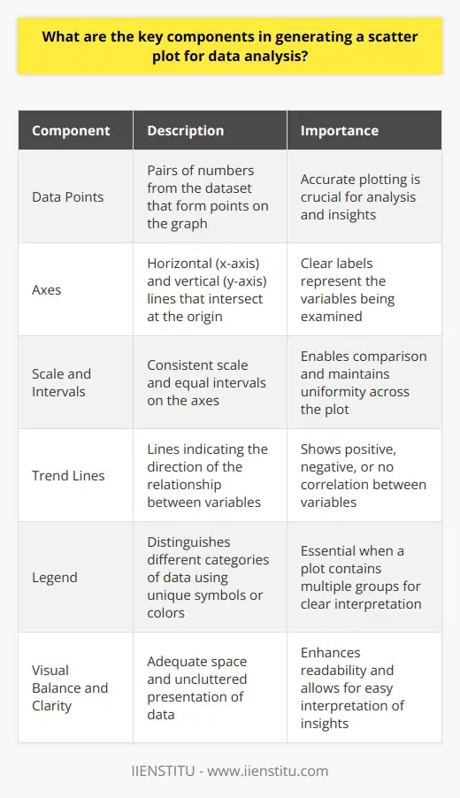
Data Points
Every pair of numbers from the dataset forms a data point. Each point plots on the graph according to its x (horizontal) and y (vertical) values. Accurate plotting is crucial for analysis.
Axes
A scatter plot has two axes. The x-axis traverses horizontally. The y-axis extends vertically. They intersect at a point called the origin. Each axis should have a clear label. Labels represent the variables we are examining.
Scale and Intervals
The axes need a consistent scale. This enables comparison. Intervals break the scale into equal parts. They must stay uniform across the plot.
Titles and Labels
Titles capture the essence of the scatter plot. They should be concise yet descriptive. Axis labels tell us what each axis represents. Units of measurement often accompany these labels.
Trend Lines
Often, analysts add trend lines to scatter plots. These lines indicate the direction of the relationship between variables. They can show positive, negative, or no correlation.
Legend
A legend is essential when a plot contains multiple groups. It distinguishes different categories of data. Each category typically has a unique symbol or color.
Data Point Markers
Markers represent the data points. Solid circles are common, but other shapes can serve. Distinct groups may have different markers.
Crafting a Scatter Plot
To create a scatter plot, one starts by plotting each data point. A clear Cartesian plane hosts these points. The origin marks the zero point for both axes.
We then set a scale that accommodates the data range. Plotting points according to their values follows. After plotting, inspecting the points for patterns is critical.
Adding a trend line can give further insight. It shows how strongly the variables correlate. A tight cluster of points around the line suggests a strong correlation. Points widely scattered around the line suggest a weak correlation.
Visual Balance and Clarity
Visual balance enhances readability. Leave enough space so that the viewer can easily interpret the data. A cluttered scatter plot can obscure important insights.
Ensuring Accuracy and Relevance
Accuracy in a scatter plot is non-negotiable. Even minor errors can lead to faulty conclusions. Always double-check values, scales, and labels.
Do not overload the plot with too many variables or categories. This can confuse rather than clarify. Focus on the relevant data. Ensure that each element serves the analysis.
In conclusion, a scatter plot relies on careful plotting, proper scaling, and clarity of presentation. By focusing on these key components, analysts can unlock the rich insights that scatter plots offer.

How does a scatter plot help in understanding the correlation between two variables in a data set?
Understanding Scatter Plots
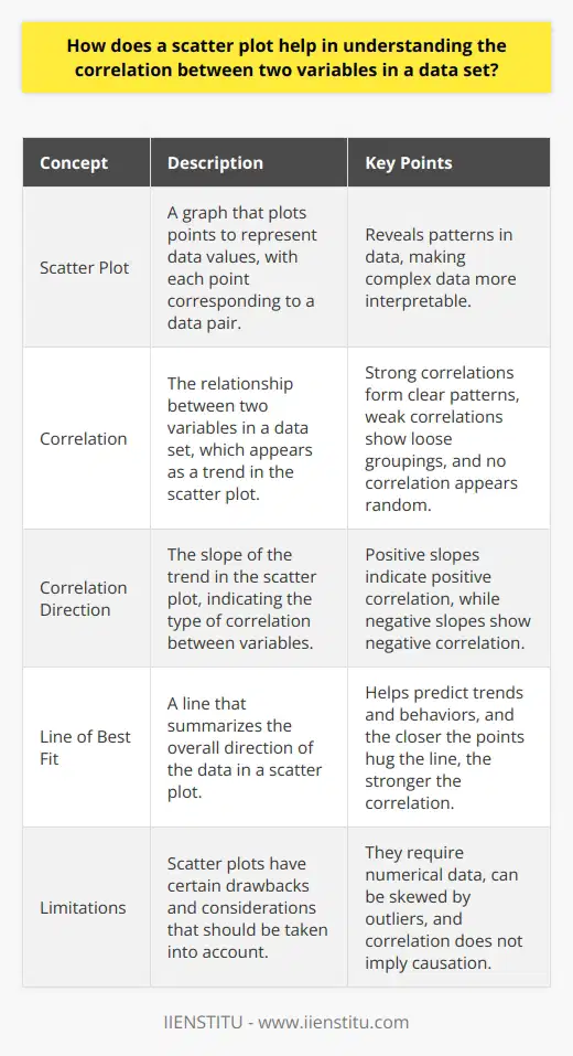
A scatter plot reveals patterns in data. It plots points to represent data values. Each point corresponds to a data pair. One variable marks the horizontal axis. The other marks the vertical axis.
Identifying Correlation
Correlation appears as a trend in the plot. Strong correlations form clear patterns. Weak correlations show loose groupings. No correlation appears random.
Correlation direction matters. Positive slopes indicate positive correlation. Negative slopes show negative correlation.
Scatter plots show variable relationships effectively. They make complex data interpretable.
A line of best fit can help. It summarizes the overall direction of the data. It can predict trends and behaviors.
Assessing Correlation Strength
The closer the points hug the line, the stronger the correlation. Scatter plots thus help us measure relationship strength. Distant points weaken perceived correlation.
Correlation does not imply causation. Scatter plots clarify this. They invite skepticism and further inquiry.
Advantages of Scatter Plots
Flexibility: Scatter plots handle large data sets well.
Clarity: They make seeing relationships easy.
Efficacy: They can compare multiple data sets.
Drawbacks and Considerations
Scatter plots require numerical data. They do not work well with categorical data. Outliers can skew interpretation. Always consider the context of the data.
Scatter plots serve as tools for preliminary analysis. Use them to form hypotheses, not to confirm them.
In conclusion, scatter plots are valuable in statistics. They provide a simple way to grasp complex relationships. Always analyze them critically.

What are some common challenges and potential solutions in interpreting scatter plots in visual data analysis?
Common Challenges in Interpreting Scatter Plots
Scatter plots are fundamental tools in visual data analysis. They display values for two variables for a set of data. Researchers and analysts often turn to these plots to understand relationships between variables. Yet, interpreting them can pose several challenges.
Identifying the Relationship
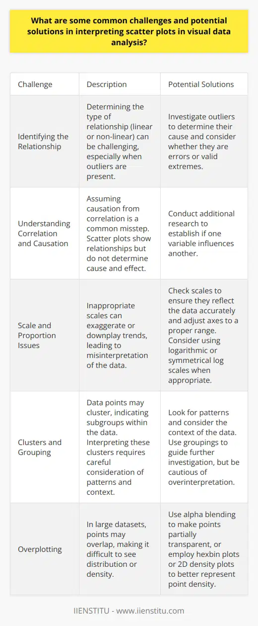
Determining the type of relationship represented is crucial. It isn't always straightforward. Relationships can be linear or non-linear. Outliers can distort perception. They may suggest a relationship where none exists. Or they can hide one that does. To address this, one must investigate outliers. Determine their cause. Consider whether they are errors or valid extremes.
Understanding Correlation and Causation
Assuming causation from correlation is a common misstep. Scatter plots show relationships. They do not determine cause and effect. Analysts must avoid this trap. Additional research often helps. It establishes if one variable influences another.
Scale and Proportion Issues
Inappropriate scales can mislead. They can exaggerate or downplay trends. Analysts must check scales. Ensure they reflect the data accurately. Adjusting axes to a proper range can provide better insights. One must consider using logarithmic or symmetrical log scales when appropriate.
Clusters and Grouping
Data points may cluster. This can indicate subgroups within the data. Interpreting these clusters requires care. One must look for patterns. Consider the context of the data. Groupings can guide further investigation. Yet, they may also lead to overinterpretation.
Overplotting
With large datasets, overplotting can occur. Points overlap. This makes it hard to see distribution or density. Solutions include alpha blending. It makes points partially transparent. Other useful methods are hexbin plots or 2D density plots. They can better represent point density.
Color and Marker Choices
Color and markers enhance scatter plots. They differentiate data points. But poor choices can confuse. One must use colors and markers clearly. They must avoid color overlap. They need to ensure markers are distinct.
Solutions in Interpreting Scatter Plots
Investigate outliers before drawing conclusions.
Supplement plots with additional research on causation.
Adjust scales to reflect the data's range accurately.
Use scale transformations when normal scales don't work well.
Look for clustering but maintain a critical eye on their implication.
Employ alpha blending or hexbin plots to counteract overplotting.
Choose colors and markers that provide clear differentiation.
Interpreting scatter plots is part science, part art. Data analysts must bring a critical eye to these visual tools. By understanding these challenges, they can extract valuable insights from scatter plots. The solutions outlined can guide a thoughtful, robust analysis.


