In today's increasingly connected world, I've often found myself fascinated—and sometimes overwhelmed—by the complexity of the systems that surround us. Whether it's the intricate workings of a bustling city, the intertwined processes within an organization, or even the dynamics of a simple family unit, the relationships and interactions can be mind-boggling. I remember a time when, working on a project to improve efficiency in our company, I felt like I was wading through a web of interdependent variables with no clear starting point.
At the heart of such complexity lies a web of relationships that govern the functionality and outcomes of systemic interactions. Traditional analysis methods often fall short when it comes to unraveling these complex problems. That's when I discovered tools like the interrelationship digraph, and they truly were a game-changer. They provided a way to visualize and analyze the intricate ties that bind various elements together.
With this exploration, I hope to share not just the technical aspects of digraph analysis but also how it can transform the way we approach problem-solving and decision-making. By delving into the nuances of these tools, we can define problems more effectively and strategize solutions with greater confidence.
Exploring the Basics of Digraphs
Defining Digraphs
So, what exactly is a digraph? Simply put, a digraph, or directed graph, is a mathematical structure used to represent relationships where the direction of interaction matters. Unlike simple graphs where relationships are mutual and bidirectional, digraphs illustrate one-way interactions, which is crucial in many real-world scenarios.
For instance, think about the relationship between a manager and their direct reports. The manager assigns tasks and provides feedback, while the employees may report progress or issues upwards. However, the flow of authority is primarily from the manager to the employee. This directional relationship is perfectly captured by a digraph.
By using digraphs, we can map out these relationships, highlighting how one element influences another. This is incredibly useful in complex problem-solving, where understanding the flow of influence or causality can lead to more effective solutions.
Understanding Interrelationship Digraphs
Digging a little deeper, interrelationship digraphs specialize in highlighting both direct and indirect connections between variables in a system. They're not just about who influences whom, but also about how strong that influence is, and whether it feeds back into other elements.
For example, in a production process, increasing the speed of one machine might impact the workload on the subsequent machine, potentially causing a bottleneck. An interrelationship digraph can help visualize these connections, allowing managers to anticipate issues before they arise.
This tool becomes invaluable when we need to analyze problems where multiple factors are interacting in complex ways. By mapping relationships, we can identify which elements are the most influential—those that, if changed, would have the greatest impact on the system as a whole.
Unveiling the Interrelationship Digraph
The Process of Creating an Interrelationship Digraph
Creating an interrelationship digraph might seem daunting at first, but it's a straightforward process once you get the hang of it. Let me walk you through it using an example from my own experience.
When I was tasked with improving customer satisfaction in our service department, I began by defining the problem: customers were reporting delays in response times. To tackle this, I gathered a team to identify all factors contributing to the issue.
Here’s how we approached it:
1- List all the factors: We brainstormed and came up with elements like staffing levels, training quality, workload distribution, communication tools, and customer query complexity.
2- Determine relationships: We examined how each factor influenced the others. For instance, insufficient training might lead to longer handling times, which increases workload, leading to delays.
3- Draw the digraph: We represented each factor as a node and drew arrows to show the direction of influence. An arrow from 'training quality' to 'handling time' indicated that training quality affects handling time.
4- Analyze the connections: By counting the number of outgoing and incoming arrows for each node, we could see which factors were the biggest influencers and which were most affected.
This process allowed us to pinpoint that improving training quality would have a significant positive ripple effect throughout the system.
Interpreting the Interrelationship Digraph
Once the digraph is complete, the real insights come from interpreting it. Here's what to look for:
Key Drivers: Nodes with many outgoing arrows are key drivers. They influence many other factors.
Key Outcomes: Nodes with many incoming arrows are highly influenced by others.
Feedback Loops: Circular connections indicate feedback loops, which can amplify effects.
In our example, 'training quality' emerged as a key driver, while 'customer satisfaction' was a key outcome. Understanding this allowed us to focus our efforts on areas that would yield the greatest improvement, rather than spreading resources thinly across all areas.
Digraph Analysis in Practice
Practical Applications of Digraph Analysis
Digraph analysis isn't limited to business problems; its applications are vast:
Quality Improvement: In manufacturing, understanding how to use control charts for quality improvement can be enhanced by using digraphs to understand process interdependencies.
Public Health: Mapping disease transmission pathways to design effective interventions.
Project Management: Understanding task dependencies to optimize timelines.
Environmental Studies: Analyzing ecosystems where species and environmental factors interact in complex ways.
Education: Planning curricula where one concept builds upon another.
For example, environmental scientists use digraphs to study the impact of pollutants on various species, helping to inform conservation efforts.
Tools and Techniques for Effective Digraph Analysis
While it's possible to draw digraphs by hand, leveraging software tools can make the process more efficient, especially for larger systems. Some options include:
Microsoft Visio: Offers templates for flowcharts and diagrams.
Gephi: An open-source platform for network visualization and analysis.
R and Python Libraries: For those comfortable with coding, packages like igraph can handle complex networks.
Using these tools, you can:
Create dynamic models that update as data changes.
Visualize weighted relationships by adjusting arrow thickness.
Identify clusters and patterns that aren't immediately apparent.
Moreover, combining digraph analysis with problem-solving strategies like the Problem-Solving Approach or Decision Making & Problem Solving frameworks can lead to more robust solutions.
Advanced Concepts in Digraphs
Feedback Loops and Network Dynamics
Understanding feedback loops is crucial in systems where actions can have long-term consequences. In economics, for example, a change in interest rates can affect consumer spending, which in turn influences economic growth, feeding back into future interest rate decisions.
Identifying these loops can help predict system behavior and avoid unintended outcomes. By analyzing these dynamics, policymakers and business leaders can make more informed decisions.
Trends and Innovations in Digraph Analysis
As technology advances, so does our ability to analyze complex systems. Artificial intelligence and machine learning are now being applied to digraph analysis to handle massive datasets.
These innovations allow for:
Real-time analysis: Monitoring systems as they evolve.
Predictive modeling: Forecasting outcomes based on current trends.
Enhanced visualization: Using 3D models and interactive dashboards.
Staying updated with these trends is essential for anyone looking to harness the full power of digraph analysis in today's data-driven world.
Conclusion
There's something incredibly satisfying about untangling a complex network of relationships and emerging with clarity. Through interrelationship digraphs, we can analyze problems more effectively, identify key influencers, and implement strategies that lead to meaningful improvements.
Whether you're dealing with a complex problem at work, trying to understand global issues, or simply curious about the interconnectedness of systems, digraph analysis offers invaluable insights.
I've found that incorporating these tools into my work has not only improved outcomes but also boosted my confidence in tackling challenging projects. I encourage you to explore this approach and see how it can enhance your understanding and decision-making processes.
Let's continue this journey together, sharing experiences and learning from one another as we navigate the intricate webs that make up our world.
References
Bertalanffy, L. von. (1968). General System Theory: Foundations, Development, Applications. George Braziller.
Sterman, J.D. (2000). Business Dynamics: Systems Thinking and Modeling for a Complex World. McGraw-Hill Education.
Checkland, P. (1999). Systems Thinking, Systems Practice. John Wiley & Sons.
Frequently Asked Questions
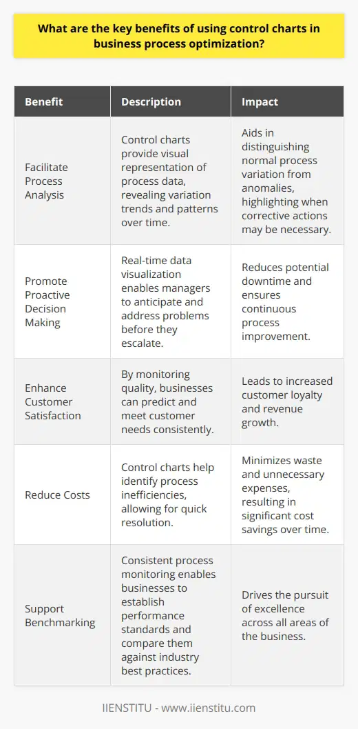
What are the key benefits of using control charts in business process optimization?
Understanding Control Charts
Control charts stand as a principal tool in statistical process control (SPC). They allow businesses to monitor process behavior. They serve as a guide for quality control measures. These tools have gained considerable importance in business process optimization.
Key Benefits of Control Charts
Facilitate Process Analysis
Control charts make process data visual. They show variation trends and patterns over time. This clarity aids in discerning normal process variation from anomalies. It highlights when corrective actions might be necessary.
Promote Proactive Decision Making
With real-time data visualization, managers preempt problems. They do not wait for issues to escalate. This approach reduces possible downtime. It ensures continuous process improvement.
Enhance Customer Satisfaction
By monitoring quality, businesses foresee customer needs. They ensure consistency in product or service delivery. Satisfied customers often translate into increased loyalty and revenue.
Reduce Costs
Control charts pinpoint inefficiencies within processes. Addressing these quickly cuts waste and unnecessary expenses. Over time, this leads to significant cost savings.
Support Benchmarking
Through consistent process monitoring, businesses establish performance standards. They compare these against industry best practices. This effort drives the pursuit of excellence across all business areas.
Increase Employee Engagement
Employees trust clear and objective performance data. They engage more in improvement initiatives. Empowered teams bring innovation and efficiency into processes.
Aid in Compliance
Several industries demand strict regulatory compliance. Control charts help businesses adhere to these standards. Compliance breaches often bring financial penalties and reputational harm.
Improve Process Stability
Control charts indicate when processes run as expected. Stability is key for making reliable forecasts. It also assures that the process will consistently meet the customer requirements.
Drive Continuous Improvement
Adopting control charts embeds a culture of continuous improvement. Businesses perpetually seek ways to better their processes. They stay ahead in competitive markets.
Implementing Control Charts Effectively
Select Appropriate Chart Types
Different processes may need different types of control charts. Select the one that best fits the data to be monitored.
Train Staff Accordingly
Successful implementation requires a skilled team. Comprehensive training ensures staff members interpret charts correctly.
Set Realistic Control Limits
Control limits must reflect actual process capabilities. Unrealistic limits mislead and may lead to unnecessary adjustments.
Monitor Regularly
Regular monitoring maintains process control. It identifies trends before they become significant issues.
Act Swiftly on Signals
When control charts signal something is off-track, act fast. Quick response prevents further deterioration of process quality.
Review and Update
Regularly review chart effectiveness. Update control measures as processes and systems evolve.
Control charts are vital for optimizing business processes. They bring comprehensive benefits that touch on quality, costs, and customer satisfaction. They encourage a proactive culture and foster continuous improvement. With correct implementation, control charts transform operations. They equip businesses to face dynamic market demands.
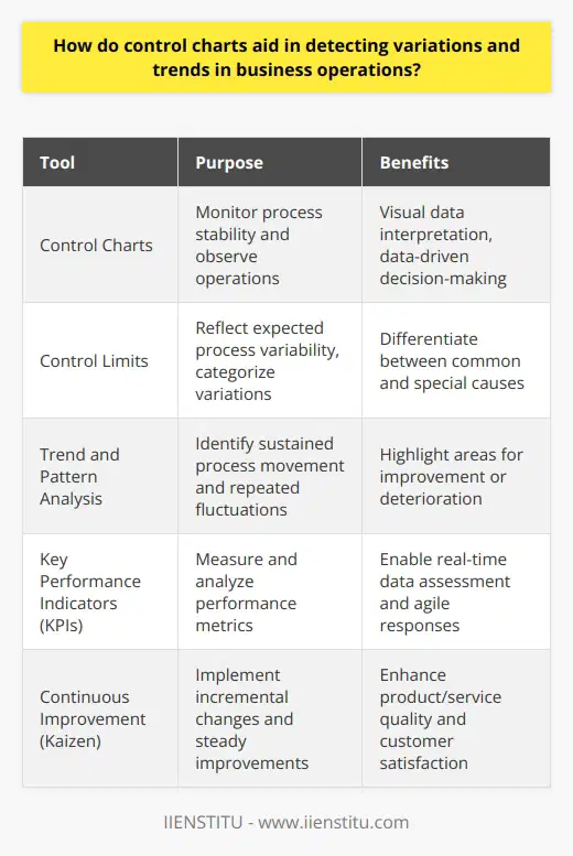
How do control charts aid in detecting variations and trends in business operations?
Control Charts Unveil Variations
Control charts stand as critical tools. They monitor process stability. Analysts use them to observe operations. These charts offer visual data interpretation. They stem from statistical process control. This field focuses on data-driven decision-making.
The Role of Control Charts
Control charts aid in spotting abnormalities. They do this by comparing current data to historical limits. These limits, called control limits, reflect expected process variability.
We categorize variations as common or special causes. Common causes indicate normal process fluctuation. Special causes signal unusual events. Control charts excel at differentiating between them.
Trends and Patterns Recognition
Trends describe sustained process movement. They can signal improvement or deterioration. Patterns, however, reveal repeated fluctuations. Control charts represent data over time. This representation highlights both trends and patterns.
Monitoring Business Operations
In business, operational consistency matters. Control charts analyze performance metrics. Key performance indicators (KPIs) often find use here. These could include production rates or quality measures.
Immediate Benefits
Businesses detect process deviations swiftly. They can address issues before escalation. This proactive stance prevents costly interruptions. Control charts make this early detection possible.
Real-time data assessment becomes feasible. Managers can observe operations as they happen. This immediacy fosters agile responses. It supports maintaining process quality.
Long-term Strategic Advantages
Strategic planning gains depth with control charts. They show process capability over time. This insight informs long-term improvement goals. Businesses can base strategies on solid data evidence.
Consistency in product or service quality depends on stability. Control charts display this stability or lack thereof. Stable processes lead to predictable outcomes.
Facilitating Continuous Improvement
Control charts play well with Kaizen, a continuous improvement philosophy. They allow for incremental changes. Kaizen emphasizes small yet steady improvements. Control charts track these changes effectively.
Control charts remain indispensable. They uncover critical insights. These insights drive both tactical and strategic decisions. Understanding process variability propels businesses forward. Stability in operations enhances customer satisfaction. It also drives long-term business success. Control charts, in essence, guide companies toward excellence.
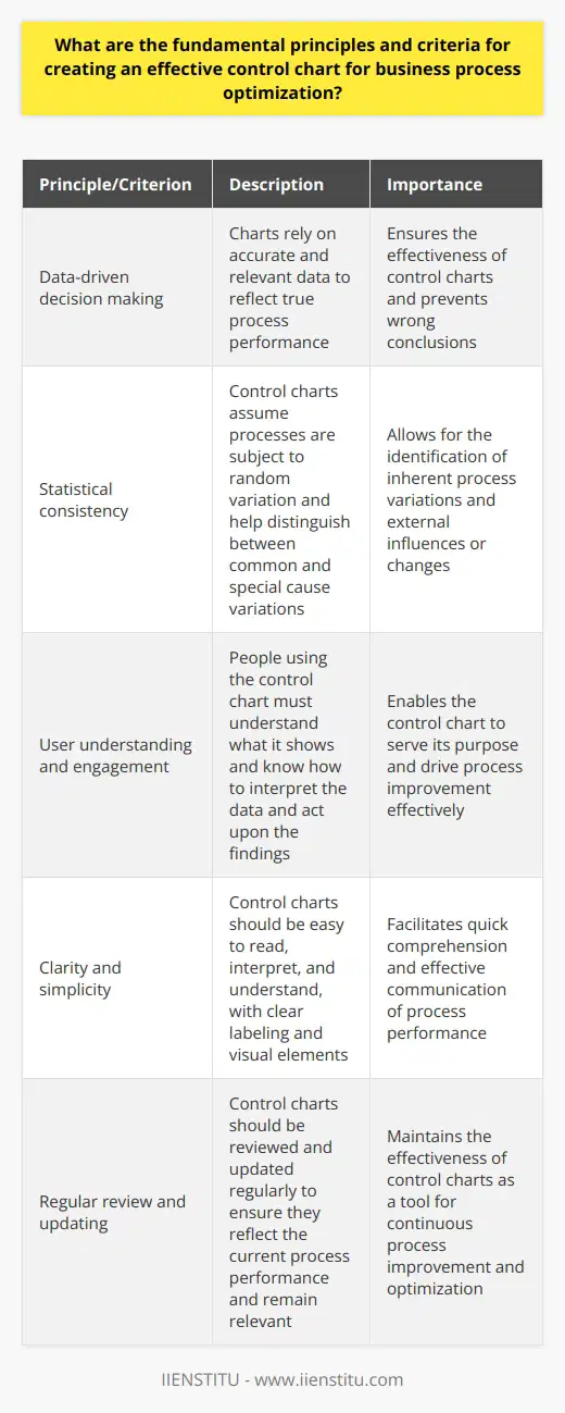
What are the fundamental principles and criteria for creating an effective control chart for business process optimization?
Understanding Control Charts in Business
Control charts serve as vital tools in business process optimization. They monitor process stability and performance over time. Managers and practitioners use these charts to identify trends, variations, and opportunities for improvement.
Core Principles of Control Charts
Data-driven decision making stands at the center of effective control charts. Charts rely on accurate, relevant data to reflect true process performance. Without reliable data, the charts lose their effectiveness and may guide users to wrong conclusions.
Statistical consistency is another pillar. Control charts assume processes are subject to random variation. They help distinguish between common and special cause variations. Common cause variations are inherent in the process while special cause variations signal an external influence or a change in the process.
User understanding and engagement is essential. For any control chart to serve its purpose, the people using it must understand what it shows. They should know how to interpret the data and act upon the findings.
Criteria for Effective Control Charts
Appropriate Selection of Variables: Select key measurable variables that provide insight into process performance.
Proper Data Collection: Ensure data collection is consistent, accurate, and timely.
Correct Chart Type: Choose a control chart that suits your data type and distribution. For example, use an XmR chart for individual measurements or an Xbar-S chart for sample means and standard deviations.
Establishing Control Limits: Calculate control limits based on historical process data. These serve as thresholds for recognizing when a process is going out of bounds.
Regular Monitoring: Update charts regularly to reflect the most current data. This monitoring helps detect deviations early.
Clear Visualization: Use clear, easy-to-understand visual elements on the chart. These help users see trends, patterns, and outliers at a glance.
User Training: Train staff on chart usage, interpretation, and response protocols. They must know what actions to take when the chart signals something is amiss.
Continuous Evaluation: Regularly review and adjust the control chart. This ensures it stays relevant to the current business processes.
Practical Application of Control Charts
To implement control charts effectively:
Identify key business processes.
Determine the critical quality characteristics to measure.
Collect a sufficient amount of data to establish a baseline.
Set control limits based on statistical analysis.
Train team members to use and respond to the chart.
Monitor the chart regularly and adjust as necessary.
By adhering to these principles and criteria, businesses create control charts that drive process improvement and optimization. These tools become cornerstones of quality management and decision making in dynamic business environments.